Nike Barcelona Home Jersey 2011/12 Review
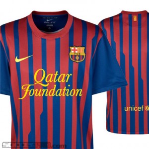 The day has come to reveal the new Barcelona jersey for the upcoming campaign and as expected, the shirt has a similar design to last year’s design, but that’s certainly not a knock on it. The stripes on this year’s iteration are much more plentiful due to the fact they are much thinner than last year’s model. It’s a more modern look that I certainly think is an upgrade from one year ago. A new sponsor has taken over the front of the shirt this year, too. In what is the largest shirt sponsorship deal in history, the Qatar Foundation have their name plastered on the home and away kits for the next five years. I will certainly miss the UNICEF sponsorship on the front of the shirt: luckily, UNICEF gets the bottom part of the back of the jersey, so Barca can still have their charitable cause while making an obscene amount of money from the Qatar Foundation. Gone, too is the yellow trim on the neck hole: I’ rather saddened too by this, as I thought it made the kit a bit more unique.
At any rate, the shirt still has the same exceptional performance you can expect from a Nike product. Dri-Fit patented technology is implemented to keep you cool in that hot Qatari sunshine or a comparable weather condition. It’s a really lightweight jersey and feels great with or without a shirt underneath. The shirt is really easy to maintain as well thanks to a 100% polyester material implemented in the shirt. It’s highly durable just like all Nike products, so you shouldn’t worry about it tearing apart after the just a month or two. Nike makes a commitment to delivering replica jerseys of high quality and for good reason when customers pay a premium price on it. But for the premium price, you get an awesome jersey that will last you a very long time.
Another year passes and another Barcelona jersey is introduced. Certainly big changes have been made in the kit, some of them good, some of them not as good. Overall, I think the new home jersey is a marked improvement over last year’s model.
Written by: Chris Behrens, soccer dude, soccerprose.com
2011 Adidas LA Galaxy Jersey vs. LA Call-Up Jersey
Beckham is going to be looking sharp in the new 2011 LA Galaxy away jersey. The question is will you be sporting the licensed or the Call-Up jersey?
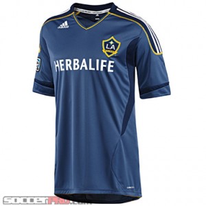 The regular licensed jersey is a dark gray-blue with navy accents on the side and on the sleeve. The classic three white stripes can be seen crossing over the shoulders as a yellow stitching outlines them. The yellow, seen in the LA crest, is also seen lining the bottom of the jersey and on the collar.
A subtle touch, which I appreciate, is how LA Galaxy repeats inside the back collar. I enjoy the placement and size of the sponsor. At times I feel the sponsor can takeover a jersey and really takeaway from the team, but Herbalife really adds to and compliments the jersey.
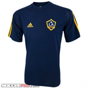 So obviously the licensed jersey has a lot of components the La Galaxy Call-Up jersey doesn’t, but I wouldn’t kick it to the curb that fast. The Call-Up jersey is very simple. It’s navy with the three yellow Adidas stripes on the sleeve. The dark color really makes the yellow pop and stand out. By just looking at the colors I automatically know it’s a jersey for the LA Galaxy. I also like the mesh located on the shoulder and underarm. It really adds some nice texture and ventilation to the shirt.
The Call-Up jersey is a great alternative for those fans that want to support the LA team but don’t have the bucks to spend on the licensed jersey. What would I choose? Obviously I would have to go with the licensed jersey, but if you are looking for simple, low cost, go with the Call-Up jersey.
Written by: Blair McNamee, soccer chick, soccerprose.com
Looking for SoccerProse updates? Like us on Facebook or subscribe to our RSS feed so you get your updates how you want. Sweet deal.
Sporting KC Away Jersey Review
The KC Wizards have changed their name,. and their kit, to become Sporting KC. Now the name change hasn’t gone down to well in some quarters, but for my part I really don’t care what they call them. The important thing is the owners are investing in the team, and building a brand new stadium that I’ve driven by, and it looks pretty sweet. The new jersey itself has three main elements, the fit, comfort, and the embroidered badge.
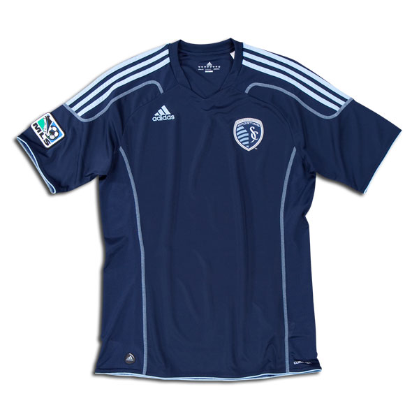 This Sporting KC soccer jersey is made from 100% polyester and feel soft on the skin and holds it temperature well. This means that even if the outside air is cold, so long as you keep moving you won’t feel it on areas the jersey covers. Also, if you wear it under a jacket, it acts like a base layer and really hold the heat in while keeping the cold out. The jersey also features Adidas’ Climacool technology. This has a fancy technical explanation, but basically it means it has vents under the arms and it won’t get water logged even if you are sweating heavily.
The official crest of Sporting KC looks great against the deep blue background of the jersey, and is brand new too. It has a line running through it at a funny angle that symbolizes the Kansas-Missouri border that cuts through the Kansas City. The crest is embroidered and should be pretty durable over the long term. The jersey also doesn’t have a big sponsor logo on the front as yet, which means there’s no advertising cluttering the front of the soccer jersey up, just the crest and Adidas logo.
Overall its a great looking shirt, comfortable, and any BBQ stains you get on it will washout without any problems. At $69.99, there not to pricey, and this shirt is very durable.
Written by: Matthew Wall, editor, soccerprose.com
Looking for SoccerProse updates? Like us on Facebook or subscribe to our RSS feed so you get your updates how you want. Sweet deal.
2011 Adidas Chivas USA Away Jersey Review
Let’s go Goats! Let’s go Goats! The new MLS jerseys are in the shop, and, though I’m certainly excited about them all, I absolutely love the Chivas USA away jersey. Adidas definitely came through for the boys with this year’s shirt.
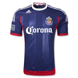 A lot is going on with this jersey, but don’t let it scare you; it all works very well together to produce an exceptional shirt. The base color of the shirt is a dark blue, reminiscent of the French shirts. The accent of the shirt is a saturated red, again reminiscent of the French. For me, the shirt can be separated into two distinct parts with the shoulders and the torso. At the shoulders, there are the classic Adidas 3-stripes running down to the bicep, where they are met with horizontal red stitching which wraps around the entire upper chest and lower shoulders of the shirt. At the right collarbone you’ve got the obligatory Adidas logo, which is a good choice. Any lower and the logo would look very out of place and would clog the torso. That’s it for the shoulders; simple, clean and to the point. The torso, however, is another story.
The torso has several elements working together to give a highly attractive jersey, and yes, this includes the team crest and the sponsor logo. The crest makes its presence known on the left chest, and just below the crest is “Corona,” written in that all-too-familiar font. Behind the crest and logo are wide stripes that make their presence known in the right light. That’s correct, folks—the stripes are about the same color as the shirt, but they’re made from a different material that allows them to shine just a little more when light bounces off them. It makes for a pretty elegant effect, if I do say so myself. The sides of the abdomen sport that red I mentioned previously with somewhat wide lines of material running from the armpit down to the hip. Once at the hip, we get another band of red running across the front, though not the back. If I were Adidas, I probably would have kept the red band running throughout the entire cuff. Oh, it seems I’ve not mentioned the sleeves! Well, the sleeve cuffs boast that red band the same as the waist, but the red wraps around the entire sleeve. The right sleeve also has a stitched MLS logo, of course. All-in-all, I really love the look of this jersey, and I’m confident you will too. The next pressing question, then, is how does it feel? How does it fit?
If you’re familiar with Adidas wear then you’re familiar with the ClimaCool technology. If not, here’s a quick rundown—the climacool allows your body to keep cool and reduces the amount of moisture built up over time, which we all know makes for a more comfortable fit. Aside from that, the jersey also fits really well, depending on how you like your shirts. As is the trend nowadays, the shirts fit closer to the skin than a normal soccer t-shirt, so keep that mind. Even with the close fit, it’s still soft and flexible, so you don’t need to worry about it all that much!
Expect to pay $69.99 or so for a shirt, which is more or less standard for a jersey. This would make a great gift for any occasion, or, hey, you could save up a little cash and treat yourself to a jersey after a solid work week! Either way, I recommend picking one of these bad boys up.
Written by: Kris Dyer, winning, soccerprose.com
Looking for SoccerProse updates? Like us on Facebook or subscribe to our RSS feed so you get your updates how you want. Sweet deal.
2011 Portland Timbers Away Jersey Review
The new crop of MLS jerseys has arrived at the shop, and these shirts are pretty snazzy. Today I’m going to be reviewing the Portland Timbers Away jersey, but you should know that it’s just one cool cat in a plethora of cool cats.
Normally, we think of soccer jerseys as being separated in horizontal layers with the shoulders and torso; however, the Timbers’ away jersey is separated into two vertical layers, divided by a center-point running down from the throat to the waist. This center-point is a stylized zigzag line that looks as if, gasp, an axe has made its mark! Jokes aside, there’s more to discuss with this shirt. The torso is 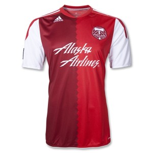 divided into two colors by the zigzag, and those two colors are (drumroll) maroon and red. I know, I know. It isn’t flashy, nor is it too edgy; nonetheless, it makes for a simple yet effective design. It catches your eye for the right reasons. The chest has a pretty standard layout as far as the crest/sponsor/designer placement goes, with one adjustment. Instead of being across from the team crest, the Adidas logo is up on the right collarbone, just underneath the collar. It’s a good placement because it keeps the shirt balanced. The Portland crest is stitched into the left chest, while the sponsor logo, “Alaska Airlines,” is just below the crest, spanning across both hemispheres. The crest and logo both dwarf the Adidas logo, which is why the shirt would feel completely unbalanced had Adidas placed their logo in the mix with the other two. What really completes the jersey is the design of the sleeves. From the shoulders to about mid sleeve, you have 3 white stripes with red background which then give way to a totally white sleeve. On the left sleeve, boom, American flag. On the right sleeve, double boom, MLS logo. It’s a simple design, but it complements the rest of the jersey so well that it really ties the shirt together.
If you’re worried that you’ll end up buying a shirt that looks cool but fits poorly, put that baby to rest. As with all other Adidas jerseys, this puppy is made with ClimaCool technology, which keeps your dry and cool (of course, I know). It fits closer to the skin than a regular t-shirt, but that isn’t to say it’s constricting or snug. It’s still flexible enough to be comfortable all day long. Expect one of these jerseys to cost around $69.99, which is a fair deal in my opinion. Take care of it, and this jersey will last you season after season of cheering the Timbers on; heck, even if you aren’t a fan and know someone who is, this will be a great gift idea.
Written by: Kris Dyer, of the planet Omicron Persei 8, soccerprose.com
Looking for SoccerProse updates? Like us on Facebook or subscribe to our RSS feed so you get your updates how you want. Sweet deal.
Nike USA Third Jersey Red Review
The new USA men’s national team jersey is out and its one of the most striking international kits of the year. The classic sash pattern is retained on this shirt, just like on the blue away jersey, but the deep red background with the blue stripe across really makes the colors pop. They look even better on the pitch, as the green grass makes the color more vibrant, and truly lets the pride of this design shine through.
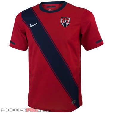 The jersey itself is made from 100% polyester and has the same Nike Dri-fit technology you’ll find on any of the other USA jerseys. Basically, this serves to vent the jersey, so you be able to stay cool and not sweat through it, even on hot days when playing with friends. The shirt is also surprisingly light weight and really fit well whether you’re skinny or a heavier set guy.
I’m pretty much positive these jersey are an instant classic, and will be snapped up quickly so you won’t want to wait to get yours. Its probably gonna be like the Mexico away jersey, they come in to a store, and their gone by the end of the week. Overall, its a great shirt, made from quality material, and really lets you show your American pride in a unique way. At $69.99 on soccerpro.com, its also available at a great price, and I think its worth picking it up.
Written by: Matthew Wall, editor, soccerprose.com
Looking for SoccerProse updates? Like us on Facebook or subscribe to our RSS feed so you get your updates how you want. Sweet deal.
Adidas Vancouver Whitecaps Away Jersey Review
Tweet
As the 19th franchise of the MLS the Vancouver Whitecaps have finally come into their own, and this new Vancouver Whitecaps away jersey celebrates it. I’m pretty sure this jersey will be an instant collectible for all those die hard fans of the white and blue as the inaugural kit of any club would be. Who knows, in 200 years, maybe they’ll be as coveted as an inaugural Manchester United jersey.
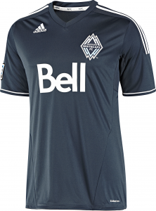 The kit is made by Adidas and clad in the deep ocean blue that has become iconic of the Whitecaps and the city of Vancouver. The jerseys trimmed on the shoulders and at the neck with white and it stands out well against the deep blue background. These colors are meant to symbolize the snow capped mountains on one side of the city of Vancouver, and the deep blue northern ocean on the other.
The jersey itself is made of a soft synthetic fabrics with Climacool technology built in to it. This act to keep your body cool and wick moisture away during hard exercise. It also guarantees a degree of durability meaning you can go play a match on turf in this shirt, take if off and wash it, and it comes out clean a vibrant. I wouldn’t recommend putting in the dryer though, the sponsor logo is heat affixed, and may peel after a few runs through. The crest, which is embroidered, will never fade or fall off, and look classy against the deep blue of the jersey. Overall, I like the look and feel of the jersey and if you’re a big Whitecaps fan, this is the shirt for you.
Written by: Matthew Wall, editor, soccerprose.com
Looking for SoccerProse updates? Like us on Facebook or subscribe to our RSS feed so you get your updates how you want. Sweet deal.
Nike Manchester United Vapor V-Neck IGN Review
Tweet
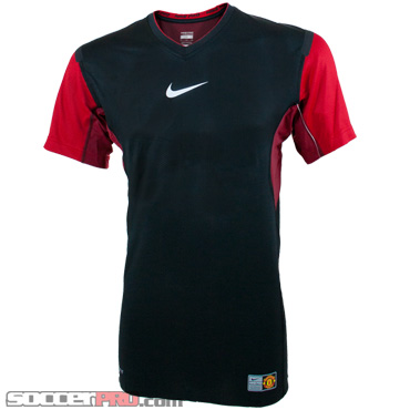 So summer is coming, and with it high temperatures and sweaty jerseys, so I thought I’d pull my Manchester United Vapor V-Neck out of the closet and give it a once over. The first thing I like about this top is the coloring. I love the jet black chest with the white Nike swoosh in the center, and it looks class with red on the arms and sides. It also hasa Manchester United badge on it, near the lower left corner, and its generally a quality piece of kit.
Its a compression top at heart, but, its designed to keep you cool on those hot days. Its got mesh panel running through out the shirt, and the material wicks a away moisture from your body so it feels cool on your skin when you’re on the run or the wind catches it. It also won’t ride up under your game jersey if you have it on underneath while playing a match. It also got anti-friction tape on the tops of the shoulders so it won’t rub on anything you have on over it.
Overall, its a good piece of kit, and does the job when your trying to keep cool on a hot day. That said, its a black shirt, so wear something over it if you’re playing in full sun as all the technology in the world won’t change the fact dark clothes get hotter in the sun.
Written by: Matthew Wall, editor, soccerprose.com
Looking for SoccerProse updates? Like us on Facebook or subscribe to our RSS feed so you get your updates how you want. Sweet deal.
Adidas Formotion Sock Review
Tweet
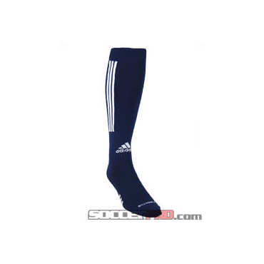 So I’m not really a believer in some of the fancy gadgets and technology they put on soccer kit these days. Give a me a cotton shirt for a jersey and I’m happy, but these Adidas Formotion socks are actually worth the extra money. I’m a tall guy, about 6’7”, so stability is one of the most important asset I look for in any athletic gear.
These socks are build fro stability, and while I never thought it would be a big factor, having worn them for a match, they really are worth it. The socks are tighter around the heel and arch of my foot so they don’t slip when I run or cut, helping my foot stay stable in my boots. The socks also have some cool Climacool technology and wick moisture away pretty well, but for me its all about the stability they help give my foot. Now if you’re wearing unstable cleats, these won’t correct that for you, but they will keep you comfortable and stable in a decent pair of boots.
Overall, at $15.99, I think they are well worth it.
Written by: Matthew Wall, editor, soccerprose.com
Looking for SoccerProse updates? Like us on Facebook or subscribe to our RSS feed so you get your updates how you want. Sweet deal.
Adidas Condivo Fleece Top Review
I’m incredibly sick of this cold weather. It’s already tough enough to play with ice on the ground. Then comes the snow, wind, and general dreariness of winter. Now, I’ve got nothing to worry about in my new Adidas soccer jacket: the incredibly warm Adidas Condivo Fleece Top
The looks of this fleece are quite classic for Adidas standards: three white stripes lining the arms sitting on an all black jacket with a small Adidas logo on the chest. Two white accent lines bring the jacket together nicely near the armpit. A 1/4 zip toward the top of the jacket makes this jacket the full package in terms of a professional-clean-cut look. Some may call it “plain-Jane” but the again, I’m into these classic styles. As for performance, this is where the jacket really is above the competition.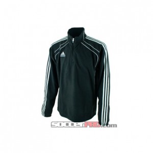
I cannot emphasize enough how surprisingly warm this jacket really is. The jacket is made of 100% polyester interlock, an extremely comfortable material that feels like being wrapped up in the best fleece blanket you’ve ever put around you. It also has a great elastic cord on the bottom of the jacket so you can keep in your amazing warmth in the bitter cold. I put on this jacket in place of my current heavy winter jacket and actually felt the fleece top was just as warm, if not warmer, than my current jacket. Elastic cuffs by the jacket’s hand holes allow the warmth to get trapped in the jacket, a terrific and now relatively standard feature of soccer jackets. To wrap it all up into a sweet deal, Adidas has included its patented ClimaWarm technology, which helps improve thermal insulation even more. The ClimaWarm technology is also very adaptable, as the material helps the jacket to be very versatile. Whether you’re looking for just a light pullover or a way to stave off freezing temperatures, this jacket’s sweet technology allows you to all of this and more.
Overall, I’m sold on this jacket. It’s warm, extremely comfortable, and got cool classic looks.
Puma Foundation Tee Review
Who remembers playing the old FIFA games on the Sega Genesis? I certainly do, and that’s precisely why I plucked the Puma Foundation Graphic Stadium Tee off the racks in the shop. The soccer t-shirt has been in the shop for some time, and, until recently, I didn’t really know what to make of it. It’s pixilated goodness to be sure, but only now did it strike me as reminiscent of the old Sega FIFA games. I’m talkin’ about FIFA ’93 and ’94.
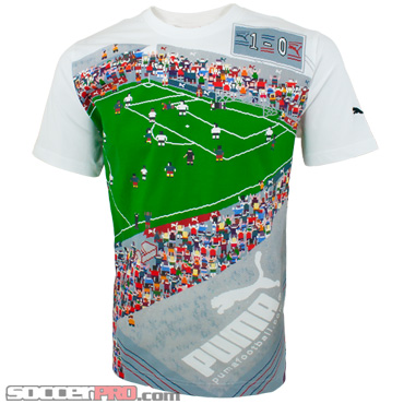 Alright, there are so many cool things about this shirt. First, the game that’s going on across the chest and upper abdomen is frozen in an action moment. A player is executing a bicycle kick from just outside the six yard box. The goalie is attempting a save, but, to be honest, I’m not sure where the ball is. Either way, it’s a goofy little touch that I’m glad Puma included. Aside from the game on the pitch, there is an awesome crowd lining the field. Puma worked a multitude of looks throughout the crowd as well. Dudes with ponytails, guys and girls with headbands, guys with baseball caps, red hair, green hair, blue hair, etc. The crowd definitely makes this shirt stand out to me. On the whole, the crowd adds another nod to the lighthearted and fun theme of the shirt. Oh, the stadium seating also has another cool aspect. There are camera people sitting on the roofs of the stands, you know, getting that award winning shot. On the bottom left hand side of the shirt, Puma even included a couple ambulances and a security guard in front of the door, just in case you wondered if this were for real or not. As for the puma logo, well, they pixilated it and stuck it on top of the stands. It’s definitely big, but it isn’t overbearing or anything. Good work Puma. One last little thing—the back of the shirt has a tiny ref holding a red card on the bottom, just to keep you in check.
Overall, I dig this shirt a lot. It’s a different style than you’ll find with any other brand, and it takes a funny nostalgic take on the game. Don’t worry—you won’t look like a little kid in this shirt. It’ll look more like a signal to others that you rocked the Sega FIFA back in the day. At $27.99 a pop, these shirts aren’t the cheapest. The price may be pushing it a little, but, as I’ve been saying so much recently, this would be perfect for a holiday gift.
Written by: Kris Dyer, soccerprose.com
Adidas Condivo Training Pants Review
Alright, party people; it’s time to talk about the Adidas Condivo Training Pants. Most of the time, I find training pants to be dull and designed with only usability in mind. I mean you can’t really fault designers for that—they are training pants and need to serve their function properly. However, these training pants by Adidas are awesomely stylish while maintaining superb usability. They’ve got a slick design running down the outside of both legs that combines the classic 3-stripes with some fluid curves and arcs flowing from the hip down to the knee before giving way to the stripes. The Adidas logo is stitched on the left thigh of the pants in a fairly large brand mark, but it isn’t obnoxious. As with many Adidas products, the color scheme is the classic black with white stripes. At this point, at least for me, it’s hard to not immediately think “Adidas” when I see black clothing with white stripes. As far as design and style goes, there really isn’t much more to say—it’s a smooth and simple design with a little bit of elegant edge. On the construction side of things, the Condivo pants offer a lot.
 First, let me mention the pockets—They are zippered! Booyah. I can’t tell you how frustrating it is to have training gear that has open pockets. How am I supposed to take my car keys or cell phone with me when I run? Adidas obviously thought the same way; thanks, guys. The pants are also made with 100% polyester and CLIMACOOL technology that provides heat and moisture management through ventilation, so you’re comfortable all of the time.
The ventilation is no joke, either. Adidas has designed the pants with mesh on the hips as well as the inner thighs, so you get a good amount of circulation to keep you dry in those, ahem, sensitive areas. The price tag on these puppies is $44.99, and you won’t need to replace them anytime soon. They’re a worthwhile investment, even if you only use them to lounge around the house or to go get the mail.
Written by: Kristopher Dyer, soccerpro.com
