Adidas 2011-12 Benfica Home Jersey Review
The new Benfica jerseys arrived at the shop recently, and, through a couple of stylistic tweaks, Adidas greatly improved the jersey from last year, turning it into a simple, sleek shirt. If you’ll recall from last year’s jersey, the tmn sponsor logo had a seafoam green kind of horizontal stripe across the chest, and this unnecessarily clashed with the red of the shirt. Thankfully, that’s been rectified and the jersey is all the better for it.
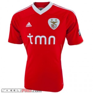 Aside from the shoulders and abdomen, there isn’t a whole lot of action going on with the shirt, but that’s completely okay; the deliberate design of the shirt really shows. From the shoulders, you have classic white 3-stripes extending from the shoulder to the mid shoulder, where the stripes give way to an overlapping piece of red fabric, which in turn gives way to an underlying gold fabric cuff. The left sleeve has a pressed on “meo” logo as well. What I love about the shoulder design is the reserved class quality it exudes. Even with the sponsor logo on the sleeve, the style is there to soak up with your eyeballs. Connecting the shoulders is a somewhat wide white collar with a shallow V-neck. Stylistically, I like it because it gives the shirt a sense of balance. For comfort, the V-neck may rub your collarbone a little bit until you’ve washed it a few times, when it’ll soften. In any case, it isn’t a major issue for comfort, but it’s definitely necessary for the style. Alright, moving downward from the shoulders, we have a simple chest with the bare minimum elements—team crest, sponsor logo and brand logo. The Adidas logo is on the right chest with the Benfica crest on the left, all tied together with a tmn logo underneath. Thankfully, as I mentioned earlier, the seafoam green stripe is gone. The plain white text over red background is far better and appealing. Complementing the minimal chest design is the elegant abdomen and back design. On both sides of the abdomen, you have mesh fabric that runs from the ribs, curves around to the lower back and is reigned in by a gold strip that traces the mesh all the way around to the back. A final elegant touch is at the merger of the two mesh strips with the left side neatly tucking in underneath the right side. It’s a subtle touch, but it really makes the shirt polished.
So the shirt is stylish and reserved, but that means nothing if it feels like an Alpaca wool sweater, right? Good thing it’s nothing like that. Of course it’s made with Adidas ClimaCool technology and of 100% polyester. It won’t be the softest shirt in your wardrobe, but that doesn’t mean it’s the roughest. If you’ve ever worn a soccer jersey, this shirt is no different. After some careful washing, the shirt will get broken in so to speak, and it’ll definitely be comfortable. Expect to pay about $75 for a shirt, which is more or less the going price for a jersey.
Written by: Kris Dyer, leading ocelot specialist, soccerprose.com
Adidas Ajax 2011/12 Review
Welcome to the post-Luis Suarez era of Ajax. Though fans might find it hard to swallow, the team has produced scores of great talent over the years and still come out on top. Notable Ajax alum, you ask? How about Zlatan Ibrahimovic, Rafael Van Der Vaart, Edwin van der Saar, Clarence Seedorf, Dennis Bergkamp, Frank Rijkaard…do you want me to keep going? Bottom line, this team will produce more stars in the future, so you can count on the new Ajax Away 2011-2012 Jersey to be noticed right away.
First, let’s get into the quality materials put into this jersey. The kit is outfitted with 100% polyester, a terrific design choice that will give you a highly durable shirt that feels great. The ClimaCool technology implemented in the shirt also helps you keep cool at all times, both in terms of style and comfort level. Adidas got the rights to produce this jersey and for good reason: all of their replica gear is quality, and this Ajax jersey is no exception.
The jersey sports a new light blue look that is quite distinctive in a good way. The same sponsor, Aegon, has stuck on for another year with the famous club and looks great and matches the professional look of the kit. An Adidas logo is stitched into the shirt to mark the quality of the product as well as the iconic Ajax crest carefully crafted on the opposite side of the chest. The black and white trim around the neck dresses up the shirt quite a bit and looks classy. Yes, the light blue look takes a bit of getting used to, however, it’s unique look belongs at a unique and special club like Ajax.
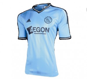
This jersey is unique in its look and professional in its performance, a mark of a great product. A must have for any fan of the Dutch giants and up-and-coming talent in general.
Adidas Chelsea 2011/12 Jersey Review
Get ready for an incredible change at Chelsea this summer. Rumor has it between 6-10 key players may be out the Stamford Bridge door this summer, including Florent Malouda, Didier Drogba, Nicholas Anelka, Paulo Ferriera, John Terry, Frank Lampard, and Jose Bosingwa. You know Abramovich will be spending this summer with the squad sitting on the wrong side of 30 now, so you can expect to see a new breed of Blues. The important thing is the new mix of squad players will be looking pretty classy in their new Chelsea jersey for the 2011-2012 campaign.
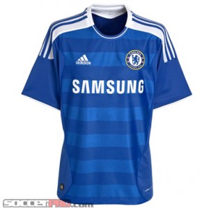
The new home thread is arguably an upgrade over the current home kit, depending on if you like stripes or not. Horizontal strips line the front of the kit with two slightly different shades of blue utilized in the shirt. While it does take a bit of getting used to (honestly, I wasn’t sold on the look initially), the home kit looks terrific if you don’t let your first impressions get the best of you. Samsung again takes over the sponsorship for the North London club and the lettering looks great, again, against the blue stripes featured on the front of the kit. An Adidas logo is stitched in the jersey along with that Blues crest you know and love. The red trim from last year’s home kit has disappeared, a bit to my disappointment. To make up for it, Adidas has moved the stripes up to the shoulders, a unique design that the company has decided to implement for future home kits releasing soon (we may have snuck a peak at some leaked images of photos to get you that information). At any rate, it’s a neat spin on a traditional kit design for a storied and proud club.
As you would expect, the jersey is made of high quality materials used by Adidas and features some patented technology that makes durability and comfort level a non-issue for wear. Clima Cool technology is pretty much a standard with Adidas replica jerseys now and for good reason: the stuff allows you to stay cool in almost any condition and the 100% polyester allows for a breathable and durable feel. The sleeves feel a bit looser than last year’s kit, so love or hate that feature. Besides that, it’s nearly an identical core design (material-wise) from last year’s home jersey, and that’s a good thing in my book.
Players come and go but the club’s spirit and style will always stay. The new kit embodies a potentially reinvigorated club coming soon with a sweet new home jersey.
Looking for SoccerProse updates? Like us on Facebook or subscribe to our RSS feed so you get your updates how you want. Sweet deal.
Nike Arsenal 2011/12 Jersey Review
Arsenal have just released their brand new home kit for next season early, and we’re fortunate enough here at soccerprose.com to be able to give you an inside peak at the new look of the Gunners. They may be out of the title race this year, but they are looking to the future, and this 150th anniversary kit should remind them of the firm foundation they have to build on.
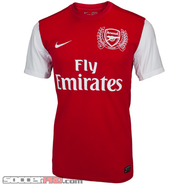 The new Arsenal 2011/12 jersey is made by Nike, so it fits almost exactly the same as last years kit, so if you were a size medium, you’re still going to need a medium. Its made from the same Nike Dri-Fit material, which help to wick the moisture away from your body when you’re sweating heavily. The crest is what makes this jersey really unique. Arsenal was founded in Woolwich in 1886 and was The Royal Arsenal back then. The crest design features 15 laurel leaves to the left side of the Club’s crest to reflect the detail on the reverse of the six pence pieces paid by 15 men to establish the Club.. The 15 oak leaves to the right of the crest acknowledge the founders who would meet in the local Royal Oak pub. Underneath the crest is one of the first recorded mottos related to the armament and battle – ‘Forward’ – with the anniversary dates of 1886 and 2011 either side of the heart of the shirt.
The shirt hasa clean and polished, if somewhat boring look. The white sleeves meet the red center of the soccer jersey on a straight line, but their is one place ion the shirt with some flair. On the back of the jersey, right below the neck reads “Arsenal,” and on the back of the crest “Victoria Concordia Crescit,” (‘Victory Through Harmony’), Arsenal’s Latin motto, which was previously featured on earlier versions of their club crest between 1949 and 2002, has been stitched.
Overall I like the new kit, and it should be up for pre-order very soon across the web, and if you’re a Gunners fan its a must have.
Written by: Matthew Wall, editor, soccerprose.com
Puma Newcastle United Third Jersey Review
If you’re a Magpie fan, than you’ve probably got the home and away kit for Newcastle already, but do you have the classy Newcastle third jersey? Well you should. This jersey is primarily white, with blue trim thats the same color as you’ll find on the Magpies away kit.
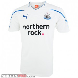 This Newcastle United jersey is made of polyester, so it’s lightweight and comfortable. It features the official team crest embroidered on the upper left chest as well as the “Northern Rock” sponsor logo across the middle. The Puma logo is visible on the left breast, and is also embroidered. My favorite part of this jersey is the fact the words “Toon Army” are stitched into the back of the collar in the same blue as the trim. Overall, it looks class, and its pretty striking for a mostly white shirt.
Its fits just right at one me at a medium, and I’m a pretty typical build for a soccer player. If you got a bit more to your body, I’d go with the extra large as the large will be too tight around the middle.
Pick one up at soccerpro.com if you’re interested, they have them for 20% off.
Written by: Matthew Wall, editor, soccerprose.com
Chicago Fire Away Jersey Review
I’m not sure if you’ve been to Toyota Park before, but it’s a terrific place to watch a quality soccer team such as the Chicago Fire. Sure, the team has changed a lot, with the loss of the iconic Brian McBride and the midfield maestro Cuauhtemoc Blanco in recent times. However, the team has added some quality so it can still gun for an MLS Cup, such as the additions of Uruguayan duo Diego Cháves and Gastón Puerari. At any rate, the sad times when the squad have to travel away from Toyota Park sees the team in a classy away jersey
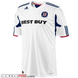
The jersey is all white, normally reserved for a home kit, but some teams reverse the trend here and wear white on the road, a trend I fully support. At any rate, it’s a very clean design which follows the principle, “less is more”. Best Buy takes the reigns for sponsorship again for the Fire and the lettering works well the Fire crest included on the chest piece. On the upper left side of the chest sits a stitched Adidas logo, as they manufacture all MLS kits for this year and years to come. Three stripes sit on the shoulders and look classy while dressing up the kit a bit more. To accent the sleeves, red coloring makes the stripes pop a bit more and again coincides with the team’s traditional color scheme of red and blue.
Through testing, I never had an issue with comfort and I don’t think I ever will. The jersey is highly breathable thanks to ClimaCool technology and is made of 100% polyester, so it’s easy to wash and maintain. It’ll also last a long time, and I’ve seen no signs of wear or tear thus far. Then again, I don’t expect it to ever fall apart since Adidas produces some serious quality with their replica gear across the board. Overall, it’s a professional jersey with modern elements and a clean feel. Stand out away from Toyota Park in style with this new Chicago Fire jersey.
Looking for SoccerProse updates? Like us on Facebook or subscribe to our RSS feed so you get your updates how you want. Sweet deal.
Portland Timbers Home Jersey Review
Talk about passion. When thinking of a traditional sports town, Portland does not exactly come to mind. However, the city loves its soccer team, which has been around since 1974 in one form or another (at that time, a North American Soccer League franchise). The franchise has ignited a now long-standing obsession with the sport. Really, it makes perfect sense to have another awesome fan base in the MLS so their inaugural season in the growing league had to be kicked off with some swag. Enter the new Portland Timbers Home Jersey.
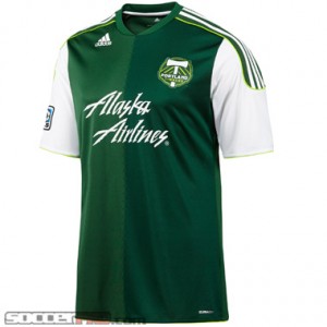 If you know anything about the Timbers, it’s that the franchise loves its greens. The Home kit exemplifies this feeling with a design full of them. The jersey is essentially divided in two shades of green: dark green and a forest green. It certainly takes some getting used to, especially if your just starting to prove your fandom to the Timbers. If you’re not a fan of the greens at first, give it some time: it certainly has grown on me. At any rate, it’s a good looking jersey thanks to some other features, too. The sleeves are white with three white stripes lining the shoulders that sit on a green pattern. It looks pretty modern and up to speed with the the way kits are going these days. They even have a modern sponsorship deal with Alaska Airlines that is shown prominently on the chest. It’s all a bit silly but looks good against the green backdrop. Finally, the shirts littered with Adidas logos and icons as well as the awesome Portland Timbers crest. In addition, the right arm is outfitted with the official MLS logo, a sign of quality for your new jersey. The look takes a bit of getting used but I’m now thoroughly sold on the design.
The jersey is made out of outstanding materials too so it’s nice and comfortable. The 100% polyester design feels great and washes well too. It’s highly durable and shown no visible wear and tear thus far. Thanks to the Clima-Cool engineering Adidas implemented in this bad boy, the shirt is highly breathable and lightweight, so you never feel too constricted or sweaty while wearing it. Overall, it’s a really high quality jersey that has looks that take a bit getting used to. Give the look a chance and you won’t be disappointed.
Looking for SoccerProse updates? Like us on Facebook or subscribe to our RSS feed so you get your updates how you want. Sweet deal.
Vancouver Whitecaps Home Jersey Review
Let’s face it: there are some pretty unique soccer jerseys out there today, which can be a very good or bad thing. Take Lyon’s jerseys. The home kit is really classy and modern and has a very appropriate sponsor. Amazingly, the away jersey is about the ugliest creation man has ever seen. Though just one example, going bold and unique is clearly either a big hit or a big miss. With the Vancouver Whitecaps jersey used for home contests, Adidas went bold. Lucky for us, they got it completely right and the result is my favorite Home kit in the MLS.
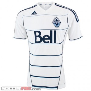 The boldness of the jersey comes in the accent lines running down various sections of the front of the kit. Horizontal lines run along the bottom of the jersey and makes a player look as if they have the most ripped abdominal area of their life. It seems like that’s a strange description, but in fact, it’s pretty accurate. At any rate, it really makes the white kit go from bland to awesome in a heartbeat. Besides the sweet contour lines, the jersey looks pretty clean. Three white stripes line either sleeve, a classic Adidas design, and look nice. The sponsor, Bell, logo looks terrific and seems appropriate for the new franchise. Plus, the Whitecaps crest is one of my favorite in the league, using a variety of blues and white.
Did I mention the jersey is really comfortable, too? All MLS kits this year are made by Adidas and outfitted with some sweet features, such as the patented Clima Cool material. What’s that mean for you? You’ll get a really breathable jersey that is lightweight and versatile. The kit is also 100% polyester so it’s highly durable and versatile. You can wear this jersey while walking to class, sleeping, eating, training…you name the situation, the jersey can probably be worn in it. Overall, the bold design makes this jersey amazing and sets it apart from the crowd. The elements of the front of the jersey coincide well together.
Looking for SoccerProse updates? Like us on Facebook or subscribe to our RSS feed so you get your updates how you want. Sweet deal.
2011 Adidas LA Galaxy Jersey vs. LA Call-Up Jersey
Beckham is going to be looking sharp in the new 2011 LA Galaxy away jersey. The question is will you be sporting the licensed or the Call-Up jersey?
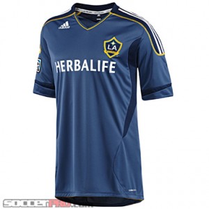 The regular licensed jersey is a dark gray-blue with navy accents on the side and on the sleeve. The classic three white stripes can be seen crossing over the shoulders as a yellow stitching outlines them. The yellow, seen in the LA crest, is also seen lining the bottom of the jersey and on the collar.
A subtle touch, which I appreciate, is how LA Galaxy repeats inside the back collar. I enjoy the placement and size of the sponsor. At times I feel the sponsor can takeover a jersey and really takeaway from the team, but Herbalife really adds to and compliments the jersey.
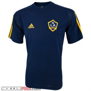 So obviously the licensed jersey has a lot of components the La Galaxy Call-Up jersey doesn’t, but I wouldn’t kick it to the curb that fast. The Call-Up jersey is very simple. It’s navy with the three yellow Adidas stripes on the sleeve. The dark color really makes the yellow pop and stand out. By just looking at the colors I automatically know it’s a jersey for the LA Galaxy. I also like the mesh located on the shoulder and underarm. It really adds some nice texture and ventilation to the shirt.
The Call-Up jersey is a great alternative for those fans that want to support the LA team but don’t have the bucks to spend on the licensed jersey. What would I choose? Obviously I would have to go with the licensed jersey, but if you are looking for simple, low cost, go with the Call-Up jersey.
Written by: Blair McNamee, soccer chick, soccerprose.com
Looking for SoccerProse updates? Like us on Facebook or subscribe to our RSS feed so you get your updates how you want. Sweet deal.
Brazil 2011 Away Jersey Review
The new Brazil is here; manager Dunga is out the door and new young talent is rushing onto the pitch in new kits. When they are away from home, A Seleção are looking awesome in one of my favorite new international jerseys, the new 2011 Brazil Away Jersey. It’s a highly comfortable, slick, and modern jersey that perfectly fits the playing style of the national team.
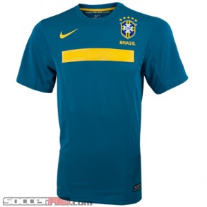
The look of the new 2011 Away jersey is completely changed from the prior away kit. Instead of a bright blue, Nike has decided to go with an aqua-blue or dark-teal color. I was skeptical at first when I heard about the new color, but after putting the jersey on, I was instantly sold. It’s one of the most unique kit colors around today and really the big selling point on the jersey for me. Besides the teal-all-over design, the shirt features an interesting but stylish yellow mesh stripe across the chest that dresses up the jersey quite a bit in a simplistic fashion. The stripe really pops and works well against the teal. Above the stripe lies the patented Nike swoosh (in yellow, of course) and the famous Brazil crest, complete with “Brasil” stitched below the crest and 5 gold stars (you’re getting a 5-star jersey after all). Nike designed a simple, clean, and amazingly good looking jersey that is highly unique and professional. Plus, the jersey is real comfortable, too.
The new Brazil Away jersey has many Nike-exclusive features that makes the shirt the high quality you expect across product lines. First, the jersey is really lightweight. Why? 100% Polyester design. This material choice also allows the product to last a really long time, since Polyester is highly durable. In addition, the new kit is outfitted with patented Dri-Fit technology. This sweet technology allows you to keep dry in almost any condition, whether you’re fighting a blizzard or weathering a 100 degree scorcher. Through testing, I felt as if the jersey was the perfect adaptable mix of lightweight feel, comfort, and durability.
Bottom line: this jersey is incredible. The shirt is highly comfortable, durable and has a terrific color scheme that will stand out from the crowd in a great way. Pick up the new Brazil Jersey if you want to get one of the coolest international jerseys.
Looking for SoccerProse updates? Like us on Facebook or subscribe to our RSS feed so you get your updates how you want. Sweet deal.
USA Women’s Away Jersey Review
The USA women’s team proved worthy of their Germany spot after winning the Algarve Cup. The USA is playing their game and is expecting to do big things once June rolls around. June 26th starts off the women’s world cup and the USA apparel is in! The USA jerseys will be sure to stand out this year with a new bold look.
 The USA womens away jersey is black with red accents that run down from either side of the collar and come together about half way down. Its got a white Nike crest embroidered on the right breast, and the US Soccer crest on the left. The material is Dri Fit making it very light and airy. The Dri Fit material does a great job at pulling away sweat to help keep you dry and comfortable. The fit of the jersey’s are pretty relaxed and very true to size so you don’t have to worry about them making you look frumpy.
The jerseys are sure to be a hit because they go so well with a pair of jeans and fit tightly enough that you can wear them out of the house. It also great for working out at the gym, or just lounging around the house. My favorite thing to do with it is to throw on my boy shorts and just hang out in my room while I’m studying for finals cause it keeps you warm really well. They also go great the fancy new womens USA soccer jackets they’ve come out with to match. Make sure you grab a jersey to show your support the USA women’s team in the 2011 World Cup.
Written by: Blair McNamee, soccer chick, soccerprose.com
Looking for SoccerProse updates? Like us on Facebook or subscribe to our RSS feed so you get your updates how you want. Sweet deal.
2011 Portland Timbers Away Jersey Review
The new crop of MLS jerseys has arrived at the shop, and these shirts are pretty snazzy. Today I’m going to be reviewing the Portland Timbers Away jersey, but you should know that it’s just one cool cat in a plethora of cool cats.
Normally, we think of soccer jerseys as being separated in horizontal layers with the shoulders and torso; however, the Timbers’ away jersey is separated into two vertical layers, divided by a center-point running down from the throat to the waist. This center-point is a stylized zigzag line that looks as if, gasp, an axe has made its mark! Jokes aside, there’s more to discuss with this shirt. The torso is 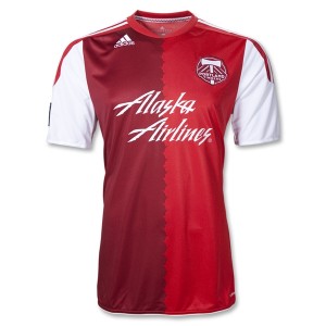 divided into two colors by the zigzag, and those two colors are (drumroll) maroon and red. I know, I know. It isn’t flashy, nor is it too edgy; nonetheless, it makes for a simple yet effective design. It catches your eye for the right reasons. The chest has a pretty standard layout as far as the crest/sponsor/designer placement goes, with one adjustment. Instead of being across from the team crest, the Adidas logo is up on the right collarbone, just underneath the collar. It’s a good placement because it keeps the shirt balanced. The Portland crest is stitched into the left chest, while the sponsor logo, “Alaska Airlines,” is just below the crest, spanning across both hemispheres. The crest and logo both dwarf the Adidas logo, which is why the shirt would feel completely unbalanced had Adidas placed their logo in the mix with the other two. What really completes the jersey is the design of the sleeves. From the shoulders to about mid sleeve, you have 3 white stripes with red background which then give way to a totally white sleeve. On the left sleeve, boom, American flag. On the right sleeve, double boom, MLS logo. It’s a simple design, but it complements the rest of the jersey so well that it really ties the shirt together.
If you’re worried that you’ll end up buying a shirt that looks cool but fits poorly, put that baby to rest. As with all other Adidas jerseys, this puppy is made with ClimaCool technology, which keeps your dry and cool (of course, I know). It fits closer to the skin than a regular t-shirt, but that isn’t to say it’s constricting or snug. It’s still flexible enough to be comfortable all day long. Expect one of these jerseys to cost around $69.99, which is a fair deal in my opinion. Take care of it, and this jersey will last you season after season of cheering the Timbers on; heck, even if you aren’t a fan and know someone who is, this will be a great gift idea.
Written by: Kris Dyer, of the planet Omicron Persei 8, soccerprose.com
Looking for SoccerProse updates? Like us on Facebook or subscribe to our RSS feed so you get your updates how you want. Sweet deal.
LA Galaxy Away Jersey Review
Though the Beckham days in a Galaxy uniform are over, the Galaxy are still rolling on in awesome fashion with the new jerseys this season, designed by Adidas. The LA Galaxy away jersey may be tamer and simpler than most of the other MLS jerseys, but it’s still very appealing and can hold its own. For today, we’ll be talking about the away jersey, which I prefer (between you and me).
 The away jersey is composed of three main colors: blue-gray, dark blue-gray and gold. Shocking, I know. Most of the action in this shirt rests in the shoulders and sleeves, which is alright by me. It’s a change of pace, if nothing else. As with a lot of Adidas jerseys, the 3-stripe design juts out from the collar down to the mid-sleeve. The stripes themselves are white on top of a dark blue mesh background, and are outlined by some boss gold stitching. The collar, too, has a narrow piece of gold fabric just below the throat, which completes the sweet gold outline touch of the shoulders. As for the sleeves, well, they’ve got some interesting cuff designs. Rather than being stitched over the main piece of fabric, the cuffs have a darker blue-gray fabric stitched underneath the main fabric, which definitely offers a unique and classy touch to the shirt. Of course there are also the following obligatory elements: the MLS logo is stitched on the sleeve; the LA Galaxy crest is stitched on the left chest; the Herbalife sponsor logo (which works very well might I add) is pressed across the chest and the Adidas logo is stitched just below the right collarbone. The other element on the jersey is the dark blue-gray mesh side abdomen slots. It’s a ventilated mesh, but you wouldn’t know it just by cursory glance. Adidas did a great job making the ventilation aspect appear suave and not obnoxious. Very cool. Finally, the very bottom of the shirt has another narrow piece of gold fabric which sneaks its head out from under the cuff, which provides a subtle touch of elegance to round out the jersey. Overall, the look of this jersey is very reserved yet greatly elegant. It will be appealing to those who aren’t even fans
of the Galaxy, I think.
Aside from looking cool, this jersey also fits well and feels comfortable. It has a silky feel to the touch, but it’s soft on the body. It’s also elastic enough to sit comfortably on top of your skin without feeling constrictive. Of course it’s also made with Adidas ClimaCool technology to keep you cool and dry. For $69.99, you’re getting a ballin’ shirt that can be used as a spectator, as a player or just as a person out on the town. If you’re on the fence on whether or not you should pick this jersey up, I highly recommend it and hope this review helped!
Written by: Kris Dyer, Colonel, Omicron Persei-8 Military, soccerprose.com correspondent.
Looking for SoccerProse updates? Like us on Facebook or subscribe to our RSS feed so you get your updates how you want. Sweet deal.
Sporting KC Away Jersey Review
The KC Wizards have changed their name,. and their kit, to become Sporting KC. Now the name change hasn’t gone down to well in some quarters, but for my part I really don’t care what they call them. The important thing is the owners are investing in the team, and building a brand new stadium that I’ve driven by, and it looks pretty sweet. The new jersey itself has three main elements, the fit, comfort, and the embroidered badge.
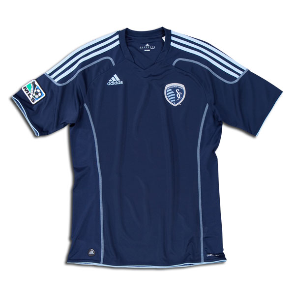 This Sporting KC soccer jersey is made from 100% polyester and feel soft on the skin and holds it temperature well. This means that even if the outside air is cold, so long as you keep moving you won’t feel it on areas the jersey covers. Also, if you wear it under a jacket, it acts like a base layer and really hold the heat in while keeping the cold out. The jersey also features Adidas’ Climacool technology. This has a fancy technical explanation, but basically it means it has vents under the arms and it won’t get water logged even if you are sweating heavily.
The official crest of Sporting KC looks great against the deep blue background of the jersey, and is brand new too. It has a line running through it at a funny angle that symbolizes the Kansas-Missouri border that cuts through the Kansas City. The crest is embroidered and should be pretty durable over the long term. The jersey also doesn’t have a big sponsor logo on the front as yet, which means there’s no advertising cluttering the front of the soccer jersey up, just the crest and Adidas logo.
Overall its a great looking shirt, comfortable, and any BBQ stains you get on it will washout without any problems. At $69.99, there not to pricey, and this shirt is very durable.
Written by: Matthew Wall, editor, soccerprose.com
Looking for SoccerProse updates? Like us on Facebook or subscribe to our RSS feed so you get your updates how you want. Sweet deal.
Nike USA Third Jersey Red Review
The new USA men’s national team jersey is out and its one of the most striking international kits of the year. The classic sash pattern is retained on this shirt, just like on the blue away jersey, but the deep red background with the blue stripe across really makes the colors pop. They look even better on the pitch, as the green grass makes the color more vibrant, and truly lets the pride of this design shine through.
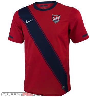 The jersey itself is made from 100% polyester and has the same Nike Dri-fit technology you’ll find on any of the other USA jerseys. Basically, this serves to vent the jersey, so you be able to stay cool and not sweat through it, even on hot days when playing with friends. The shirt is also surprisingly light weight and really fit well whether you’re skinny or a heavier set guy.
I’m pretty much positive these jersey are an instant classic, and will be snapped up quickly so you won’t want to wait to get yours. Its probably gonna be like the Mexico away jersey, they come in to a store, and their gone by the end of the week. Overall, its a great shirt, made from quality material, and really lets you show your American pride in a unique way. At $69.99 on soccerpro.com, its also available at a great price, and I think its worth picking it up.
Written by: Matthew Wall, editor, soccerprose.com
Looking for SoccerProse updates? Like us on Facebook or subscribe to our RSS feed so you get your updates how you want. Sweet deal.
2011 Adidas Mexico Away Jersey Review
The new Mexico Away jersey has just been released and I have to say if you thought last years was good this one will blow you mind. The jersey is black with red stripes on the shoulders and gold details around the collar. It also has gold stripes running down the either side under the arms and banded around the end of the shirt sleeves.
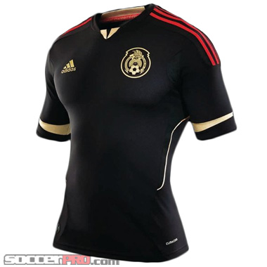 The Mexico crest is in gold on the left breast with the iconic eagle, Aztec calendar, and soccer ball. On the inside of the back of the collar is printed “Somos Guerreros,” or “we are warriors” and it makes for a strong design that will strike fear in the hearts of your opponents. The shirt itself is made from Adidas’ Climacool technology fiber, so the 100% polyester fabric won’t be hot or get sweaty when you are running during a match.
The other great thing about this jersey is all the name sets come in gold, so the back and the front of the jersey are equally striking when you’re out around the town. Overall, it’s a great jersey, and any true fan of los Aztecas would be proud to wear it.
Written by: Matthew Wall, editor, soccerprose.com
Looking for SoccerProse updates? Like us on Facebook or subscribe to our RSS feed so you get your updates how you want. Sweet deal.
2011-12 France Away Jersey Review
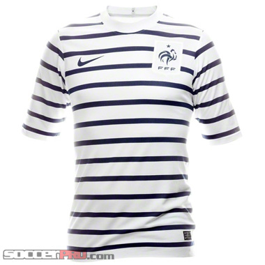 Nike have taken over from Adidas as the official supplier and designer of kit for the French National team, and this new design is definitely something different. Now I’m not a fan of France of late, but I used to love watch Zidane and the rest of them run circles round the other sides during the World Cup. But ever since Henry’s handball put out my beloved Ireland I haven’t been able to stomach them. Thats said, its good to see them making a new start wand working their way back to glory. This France jersey represents that new beginning.
The design is striking with a white background covered with horizontal blue stripes. It reminds of a French Navy uniform from the 1940’s, and has that certain class you can only find on something French. Its made out of 96% polyester, so its lightweight and ventilated well. The white color also makes it good for playing on a hot day with your friends as it will reflect the sun better than a black Mexico jersey.
Overall, its a quality shirt, and a great way to make a new start with a new French national side. At $79.99, they aren’t cheap, but its worth shelling out for a classy shirt like this.
Written by: Matthew Wall, editor, soccerprose.com
Looking for SoccerProse updates? Like us on Facebook or subscribe to our RSS feed so you get your updates how you want. Sweet deal.
adidas Argentina Away Jersey 2011 Review
Time to gear up for 2011, the year of tasty international friendlies, Euro 2012 qualification, Copa America, and the Gold Cup in the good old U.S. of A. At any rate, Argentina will blend a mix of veteran presence (see Javier Zanetti and Esteban Cambiasso) and the emergence of exciting young world-class talent (Javier Pastore, Lionel Messi, Sergio Aguero, and Angel di Maria). They’ll keep a pretty similar design for their home endeavors, however, their traveling kit is a brand new design and frankly one of my favorite away jerseys out there. Introducing the new Argetina jersey.
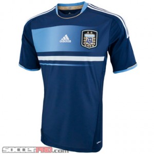 The jersey is one of the most unique designs adidas has come out with a recent kit across any soccer team, as the company normally lets Nike handle the distinct designs. The kit is dark blue all over, certainly not a step outside the bounds of old Away Argentina kits. However, the similarities end here. The chest area is highly stylistic and modern in design. A light blue fading panel lines the majority of the chest and brings out the pride of Argentina’s home color scheme instantly. White and light blue contour lines sit below the big chest piece and dress up the shirt nicely. In the middle of the light blue fading panel lies the iconic Adidas logo which you have come to know and love. Lying beside it is the classic Argentina crest, which sits on practically every Argentina jersey constructed (at least every legitimate one). The arms feature three white lines that run down the length of the arm, a classic Adidas design. Light blue strips line the ends of the arm holes and really make the jersey pop a bit more. Finally, the neck hole even looks impressive. Gold and light blue contour lines run around the length of the neck hole, exuding classic good looks and modern styling all-in-one delightful package. Throw a Messi name set on the back and you’ve got yourself one of the coolest, most distinct jerseys out there.
This jersey is real comfortable, too. ClimaLite technology is embedded into the shirt, meaning you’ll get a cotton-poly blend shirt that wicks away moisture and keeps you dry while you run around the pitch, head out to hang out with your friends, or just lounge around watching La Albiceleste. It’s a really lightweight jersey that’s honestly appropriate for whenever you want to support one of the most exciting squads in the World to watch take the pitch. Really, it’s probably my favorite international jersey on the market right now.
Looking for SoccerProse updates? Like us on Facebook or subscribe to our RSS feed so you get your updates how you want. Sweet deal.
Adidas Vancouver Whitecaps Away Jersey Review
Tweet
As the 19th franchise of the MLS the Vancouver Whitecaps have finally come into their own, and this new Vancouver Whitecaps away jersey celebrates it. I’m pretty sure this jersey will be an instant collectible for all those die hard fans of the white and blue as the inaugural kit of any club would be. Who knows, in 200 years, maybe they’ll be as coveted as an inaugural Manchester United jersey.
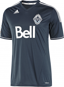 The kit is made by Adidas and clad in the deep ocean blue that has become iconic of the Whitecaps and the city of Vancouver. The jerseys trimmed on the shoulders and at the neck with white and it stands out well against the deep blue background. These colors are meant to symbolize the snow capped mountains on one side of the city of Vancouver, and the deep blue northern ocean on the other.
The jersey itself is made of a soft synthetic fabrics with Climacool technology built in to it. This act to keep your body cool and wick moisture away during hard exercise. It also guarantees a degree of durability meaning you can go play a match on turf in this shirt, take if off and wash it, and it comes out clean a vibrant. I wouldn’t recommend putting in the dryer though, the sponsor logo is heat affixed, and may peel after a few runs through. The crest, which is embroidered, will never fade or fall off, and look classy against the deep blue of the jersey. Overall, I like the look and feel of the jersey and if you’re a big Whitecaps fan, this is the shirt for you.
Written by: Matthew Wall, editor, soccerprose.com
Looking for SoccerProse updates? Like us on Facebook or subscribe to our RSS feed so you get your updates how you want. Sweet deal.
New York Red Bull 2011 Home Jersey Review
 All of the lights shine brightly on this superstar team for the upcoming season. Thierry Henry, international icon and one of the most marketable soccer players to play in the last two decades, leads the attack and captains the side in the brand new Red Bull Arena (which he has taken the train directly to the game with the common folk, so cool!) Former Barcelona standout Rafael Marquez will lead the backline and be a ball-winner so he can distribute to the rest of his team, after fears he may leave the team after just one season. After a highly disappointing post-season, the Red Bulls will be charged up that they can win and win now. To prove it, they’ve got to have the look to match their motivation, too, so they’ll be wearing some nice threads in the new New York Red Bull Home Jersey for 2011.
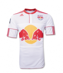
The first thing that stands out on the jersey is the blatantly huge Red Bull logo sitting just below the chest and above the bottom of the jersey. It is quite large, but it really has the Red Bull company values written all over it; energy with the basic motto of “Go Big or Go Home” (you are welcome all you Johnny Tsunami fans out there). It’s all a bit flashy but in a great way. Nice red contour line the shoulders and ends of the arms on the jersey, a clear Adidas influence. On the chest, an offset red vertical line goes down the near-middle of the shirt nearly down to the logo (perhaps they wanted buttons at some point, not sure) but it dresses it all up a bit more. An Adidas logo lies high up on the left side of the chest while the right chest side features the Red Bull crest. It’s certainly a unique jersey, but this is a unique squad. It’s really the perfect storm.
Adidas has gone all out to make this jersey feel great for any fan. ClimaCool technology lines the New York Red Bull jersey all over and I couldn’t be happier about this decision. The company has outfitted each of the MLS jerseys with this amazing material, which helps wisp away moisture, keep you cool, and keep you comfortable regardless of what harsh (or stagnant) conditions you wear the shirt around in. The jersey is also terrifically versatile. You can wear this swag on the pitch, on the couch watching the squad, or just out with your friends. It always looks good.
The Red Bulls will be looking pretty awesome all season long and you can do that too by picking up this great product.
Looking for SoccerProse updates? Like us on Facebook or subscribe to our RSS feed so you get your updates how you want. Sweet deal.
Chicago Fire Home Jersey Review
The MLS season is officially back and a lot of changes have been made to squads for the upcoming campaign. The Chicago Fire are certainly not left out of this bunch. A lot of notable names have left the team, much to the sadness of diehard Fire fans like myself. We bid adieu to Brian McBride, CJ Brown, Freddie Ljungberg, Wilman Conde Jr., and John Thorrington, all pretty significant contributers last campaign. However, some notable names have arrived at Toyota Park, including Uruguayan strike-force Gaston Puerari and Diego Chaves that should be potential game changers for the squad. At any rate, the squad will be looking pretty slick on the Toyota Park grounds with their brand new 2011 Chicago Fire Home Jersey.
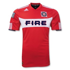
One notable and immediately noticeable change concerning the new home kit is the lack of a sponsorship. Best Buy decided (as it struggles financially with Amazon beginning to take away ground from the company) to pull their shirt sponsorship from the club. Honestly, who needs them? Certainly not Logan Pause and the boys. Let’s start with how the jersey looks without the Best Buy lettering; in short, terrific and classy. The jersey is red all over, akin to their classic colors since the club’s inception in 1997. A stylistic white panel-like pattern lies flush on the chest, with bolded “FIRE” lettering taking up the majority of the white strip. The lettering is highly stylized and blends the perfect amount of modern preferences and classic good looks. The Chicago Fire crest lies above the white panel on one side of the jersey and may look a little high up on the jersey for some tastes. I’m a fan of the unique placement. An Adidas logo lies on the other side of the chest, so you know you’re getting quality, just like the rest of the league’s awesome MLS jerseys. An MLS logo is stitched into the right arm of the jersey, so you can show your friends you’ve got official swag from an up-and-coming league. Finally, the shirt is nicely rounded out with three white lines on each shoulder and at the end of the arms, a signature Adidas design decision.
The shirt is also incredibly comfortable and versatile. I’ll wear this Chicago Fire jersey to class, on the pitch, in a training session, or just plain lounging around. It’s appropriate for almost any occasion. Adidas has outfitted the kit with patented ClimaCool technology. What’s this mean for you? Reduced heat, a lightweight material, reduced moisture accumulation, and just plain awesome comfort. The jersey is highly durable, never showing any wear or tear in the testing I put this bad boy through. The synthetic ClimaCool material is a great choice by Adidas and you get all the benefit of wearing gear similar to the pros on the pitch.
Overall, I couldn’t be happier with my new Chicago Fire Jersey. It’s a classic design that benefits from a lack of sponsorship. The kit is extremely comfortable and durable, too, so you know this will last you all season long as you cheer on the boys.
Seattle Sounders 2011 Jersey Review
Tweet
This years Seattle Sounders jersey continues the proud tradition of Seattle soccer into a new season sure ot be mark by new rivalries. With the Portland Timbers and Vancouver White Caps joining the MLS, it seem natural that these teams will compete with the Sounders for their chance to be on top of the northwest.
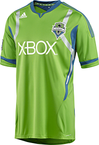 This jersey is made by Adidas and has Formotion and Climacool technology to keep you, or any player, cool and dry during a match, or when your just out for a game with some friends. The Sounders FC team badge is embroidered on the jersey along with an Adidas logo screened on the front. An MLS emblem embroidered on right sleeve with the American flag embroidered on left sleeve and of course, the iconic “XBox 360” is screen printed across the middle of the chest. Overall, its a striking and classy jersey thats great quality.
The seams are heavily stitched to prevent tearing, and even the silver strips on the arms and chest should hold up to your dryer at home for a few years at least. Overall, its a great shirt worthy of the heritage of one of the oldest professional soccer clubs in the United States.
Written by: Matthew Wall, editor, soccerprose.com
Looking for SoccerProse updates? Like us on Facebook or subscribe to our RSS feed so you get your updates how you want. Sweet deal.
Juventus Away Jersey Review
Juve is one of the oldest clubs in the country of Italy and easily one of the most successful. The club has spent all but one season in top-flight football (the all too controversial 2006-2007 campaign) and has won numerous awards across Italy and across Europe. Accolades include being the most successful club in Italy of the 20th century (as voted by FIFA) and being the only team in all of football to have ever won all possible confederation competitions and the club world title in a single season. The Bianconeri also are one of the best traveling sides on the continent. To travel well, the team has to look spiffy and that’s no problem in the brand spanking new Juventus Away Jersey.
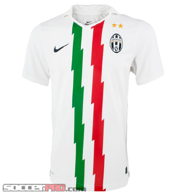 Though the club is renowned for the highly popular home kit, which has virtually remained unchanged since the club’s inception in 1897 (aka a long time), the away kit is equally as stylish in my opinion. Featuring a mostly white design, the away kit front has some pretty cool features. For one, the jersey is made by Nike, which makes the highest quality of equipment (as evidenced by the nice little Black swoosh prominently displayed on one side of the chest). The shirt has two stylistic stripes running down the center of the jersey, one red and one green. In between the two colored stripes lies a white strip, a clear nod to Italian national flag. It’s a nice feature if you’re non-soccer fans are ever confused as to wear Juve reside. On the other side of the chest lies the famous Juventus crest, complete with two gold stars lying above the crest which dress up the jersey a bit more. Overall, it’s a slick design that any Juve fan should be proud to wear.
Nike also made this jersey really comfortable. It’s made of 100% polyester, so it’s super durable and versatile to wear in almost any situation. The jersey also implements Nike’s patented and highly popular Dri-Fit material. Essentially, this technology helps you keep dry in almost any condition presented to you, whether it’s the scorching summer heat or the frigid winter cold. At any rate, the jersey is real lightweight and real comfortable thanks to this sweet technology.
Overall, if you’re looking for a unique Juventus jersey, this one’s for you.
Looking for SoccerProse updates? Like us on Facebook or subscribe to our RSS feed so you get your updates how you want. Sweet deal.
adidas AC Milan Home Replica Tee Review
The Rossoneri are a classic European powerhouse with unbelievable players. Naturally, they have one of the best home kits in all of European football, with the iconic red and black vertical stripes being the centerpiece of an excellent looking soccer jersey. For most, a $70-80 price tag is a bit steep to pay for one of these amazing AC Milan jerseys, though the quality of Adidas has put into the jerseys is undeniably awesome. Fortunately, adidas decided there were enough people who felt the $80 price tag should be cut in half so they came out with the AC Milan Home Replica Tee for just under $40. Lets jump into what you get for such a sweet price.
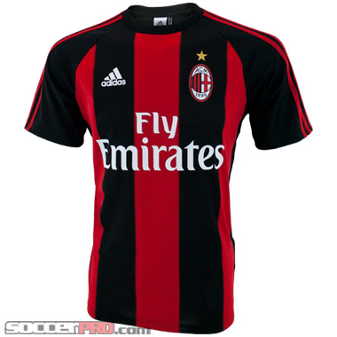
First off, the shirt looks nearly identical to the home jersey, a huge plus for the economical shopper out there. The shirt has slightly thicker stripes than the jersey, but it’s truly unnoticeable unless you compare them side-by-side in a close eye-test. At any rate, the shirt features the iconic red and black stripes us AC Milan fans love. Adorned on the front is the classic Fly Emirates logo, a company that sponsors what seems like half of European soccer powers out there. The positive you can take away from that sentiment is that the shirt is not thrown in with another failing insurance company sponsorship logo on a European power (ahem Manchester United).
At any rate, the shirt is nicely rounded out with a small white Adidas logo on one side of the chest with the clubs crest (with a small gold star above the crest) sitting on the opposite side of the chest. The arms are covered with three red stripes, a nod to the classic AC Milan red and the Adidas 3-stripe design. Finally, the back of the shirt is plain black (simple, yet attractive).
The shirt is also super comfortable. When I first put it on, I really thought I was wearing the real jersey. Adidas has outfitted the shirt with patented ClimaLit material, which manages moisture in a soft, lightweight fabric. The shirt is 100% polyester so you know it’s durable and versatile overall. In reality, the shirt is not as comfortable as the true AC Milan jersey, but Adidas sure did an excellent job at replicating the feel of the home kit, too. Overall, if you’re looking for an AC Milan jersey but don’t have the money, the economical, awesome AC Milan Home Replica Tee will do the job for you.
Looking for SoccerProse updates? Like us on Facebook or subscribe to our RSS feed so you get your updates how you want. Sweet deal.
Club America Pre Match Top Review
Club America is one of the most respected, historical Mexican clubs around and for good reason. The team plays in one of the most iconic, intimidating stadiums across all of soccer (the Estadio Azteca, a stadium with a capacity of a ridiculous 105,000) so they know they want to look classy and classic for the opposition. During warm ups, players such as Guillermo Ochoa, Oscar Rojas, and Pavel Pardo all support the club by wearing the stylish Club America Pre Match Top.
The first thing that pops on the match top is the iconic yellow coloring used throughout the majority of the shirt. If you are a supporter of the Millonetas, you’ll know this color all too well and love it. I know I do. What makes the top particularly cool looking is small black circle pattern running throughout the front of the shirt. It really dresses up the design and makes you look unique on the pitch while you’re warming up. A classic Nike swoosh and the club’s emblem sit flush on the front of the shirt too and look great. The back of the soccer shirt features the words “Club America” in all caps in a stylized form that again makes you look pretty distinguished while you get your blood pumping before a big match.
The shirt is really comfortable and for good reason. It’s made of 100% polyester and fitted with patented Nike Dri-FIT material. Nike has decided to outfit a good amount of their apparel with this sweet technology, which will help you keep dry and comfortable in almost any condition. It’s a major plus if you’re already working up a sweat in the Azteca (yes, I’m going to assume you will play there at some point in your lifetime or are already playing there. You are that talented, I just know it!) before the game. The sleeves are nice and snug and the fit is a bit tight, but that definitely helps pick up any moisture you’ll give off running around the pitch.
If you’re a fan of the biggest Mexican club around and need some training gear, this piece of Nike soccer training top is for you.
Looking for SoccerProse updates? Like us on Facebook or subscribe to our RSS feed so you get your updates how you want. Sweet deal.
Club America Jersey Review
The storied Mexican giants Club America have come out with a new jersey. Get excited, Millonetas fans. Though the club has not had the success it has had in the past in recent years, at least you’ll be looking stylish. Jump in to a new Nike jersey.
The jersey is made of 100% polyester so it’ll definitely last you a long time. Nike’s also outfitted the shirt with Dri-Fit technology. What’s this mean for you? When you are running around the field or just wearing it casually, you’ll be sure you’re going to stay nice and dry. I wore this bad boy for 2 hours and found that the Club America jersey wicked away sweat like there was no tomorrow (yes, I’m a sweaty dude, deal with it world). Plus the polyester material won’t shrink so you know you’re getting great sizing that will stay that way barring anything strange. As a Club America fan, you’ll love the flashy design, too (though this isn’t for everyone).
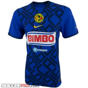
The shirt is bright blue all over, one of the staple colors included in the clubs crest. The club does have two sponsors for the jersey, a unique feature that’s certainly not seen on many soccer jerseys these days. This is one of the few complaints I do have about the jersey, though I do appreciate the look of both logos on the jersey. A small Powerade logo sits below a huge BIMBO logo, a probably testament to how much Powerade paid for it’s spot on the shirt. Above the BIMBO logo sits a yellow Nike swoosh and above that sits the Club America crest. It’s all a bit crowded but definitely works for the club with its characteristically flashy style. The jersey is also lined with an interesting but definitely fun black letter pattering that sits on the blue all over shirt and “beneath” all the logos and crests. It makes the shirt that much more unique and separates this soccer jersey from the typical replica jersey design.
Overall, the Club America 3rd jersey is a fun design that’s a bit flashy. However, the Nike quality shines through. If you’re a fan, pick it up.
Looking for SoccerProse updates? Like us on Facebook or subscribe to our RSS feed so you get your updates how you want. Sweet deal.
2011 Authentic Brazil Jersey Review
Tweet
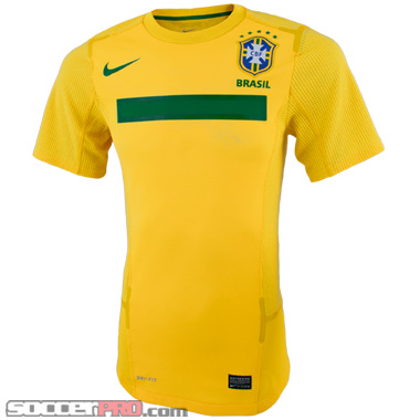 The brand spankin’ new 2011 Brazil jerseys are in the shop, and I’m definitely on board. It makes sense that they’ve parted ways with the design from last season, owing to the disappointing finish in the World Cup. Oh, and there was also that red card given to KaKa during the match against Côte d’Ivoire, which can only be described as absurd and probably shameful for both the referee and Keita. I’m sure Keita’s acting classes were worth more than he paid for in that moment. ANYWAY, let’s talk about the jerseys that will provide the team with a fresh start en route to the 2014 tournament.
Simplicity, simplicity, simplicity. That seems to be the hallmark of the 2011 Brazil jersey, almost like something straight out of Thoreau. Nike has scrapped the old shoulder design and kept the jersey clean and simple for the most part. The only visual design elements on the jersey reside on the chest. On the left, you have the easily recognizable Brazilian crest with 5 green stars stitched above it, and “Brasil” stitched below. Opposite the crest is the just as classic Nike swoosh in green. Underneath these two elements is a wide horizontal green bar that really brings balance to the shirt. In the words of the great Lebowski, it really ties the shirt together. This literally rounds out the visual side of the shirt. It’s minimal, but it’s keeping in tradition with previous jerseys. The Brazilians are known for their flashy style of football (which may be on the way out, but that’s another discussion), not their flashy jerseys. In any case, the jersey is easily recognizable as being Brazil with its yellow and green color scheme, and I for one welcome the change from last year.
As for the jersey’s construction, you have a shirt that is made of 100% polyester, so, while maybe not as soft as cotton, it’s definitely more durable and more flexible. Nike has also decided to go with a crew neck for the soccer jersey, which I believe seems to be the trend these days. Another sweet feature (and probably my favorite) implemented by Nike is the mesh design for the sides of the abdomen and underarm. Everybody needs a good amount of airflow to those areas, am I right? If you decide to wear this bad boy to a pick up game or an intense match where you’ll be cheering constantly, you’ll want the ventilation to keep the jersey from sticking to your body.
Overall, this year’s jersey is definitely an upgrade from last year. I’m not very big on shoulder designs anyway, so this fits in perfectly for my taste. It’s going to cost you the pretty much standard price of $149.99, but, just as every other Nike jersey, you’ll get what you pay for. That means you’ll have a durable and comfortable jersey that will definitely have classic appeal as years go by. If you haven’t already, I’d suggest pre-ordering one of these bad boys until they hit the store February 9th!
Written by: Kris Dyer, soccerprose.com
Adidas Liverpool Tee Review
 The new owners of Liverpool are looking to shake things up a bit. First prolific striker and World Cup villain Luis Suarez arrives. Then club legend Fernando Torres is out. Who’s next? Regardless, the important thing is they will all have the opportunity to wear some pretty cool Liverpool gear, including this terrific looking Adidas Liverpool cotton t-shirt.
The shirt is certainly one of my favorite replica tees I’v seen in a very long time, a lot because of its dashing good looks. Whichever designer decided Dark Heather gray was the right color to choose– hats off to you. Dark Heather gray is one of my favorite colors for a shirt so Adidas had me a bit sold there. Next, the shirt has a real classic design for a real classic club. The shirt is relatively plain but does have some distinctive accenting features that really bring the shirt together into a terrific looking package. 3 black stripes line the shoulders and arms of the shirt, a classic Adidas design decision that I’ve always supported. A black accenting neck line helps the dark heather gray color pop a bit more and blends well with the three black line design on the arms. The Liverpool crest lays flush against the chest of the shirt, with the famous slogan, “You’ll Never Walk Alone” professionally printed on the shirt. Finally, a small black Adidas logo brings the shirt together on the other side of the chest. Did I mention this shirt is amazingly comfortable.
Cotton is truly the way to go with shirt designs. It’s a durable material that’s easily washable in case you are running around on the training pitch with the shirt and it’s quite soft to the touch. Another good choice by Adidas in going with 100% cotton material. The shirt feels like you are wearing a breathable pillow case and quite honestly, it’s a glorious sensation. It’s the perfect length shirt that fits well to your body. If you think you are a medium in this shirt, go with the medium, as sizing is true to word.
Overall, it’s a great looking shirt in a comfortable package. I highly recommend the Liverpool Cotton Tee.
Mexico Goalkeeper Jersey Review
Mexico has been one of my favorite national teams for as long as I can remember, which just so happens to be the 1994 world cup. Originally my affinity for the squad stemmed from the national colors and their sweet jerseys. I mean, who doesn’t remember the totem jersey design from 1998? As time goes on, though, I find myself digging the squad for their players. Javier Hernández, Giovani dos Santos, and Guillermo Ochoa are exciting to watch and are definitely on the rise. However, the order of business today is not to discuss the future of Mexico’s national team, but it is instead to talk about the Adidas Mexico Goalkeeper Jersey.
At first glance, this goalkeeper jersey is a little deceiving visually—it seems to be a plain white jersey with the Adidas logo and the Mexican team crest. However, a closer look reveals a lot more going on with this jersey. The sleeves, for example, are sectioned off into three parts. The shoulders are a black background with a red 3-stripe design on top, which is of course a nice contrast with the white jersey. From the shoulder to the elbow, the jersey is indeed just white. After the elbow comes a return of the 3-stripes, although this time in green with a white background. The back of the elbow/forearm also has the necessary padding outlined by green. The sleeves are a simple, classic design that perfectly complements the front of the jersey.
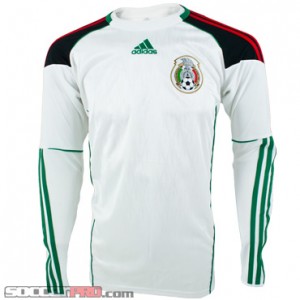 At the top center of the jersey is a green stitched Adidas logo. On the left chest is a stitched Mexican team crest, which is classic in its own right. The two sides of the abdomen are a plain and simple white area fenced in by the same green fabric lines that border the elbow pads. Sounds pretty ordinary and mundane, right? Well, that’s where the subtle design on the front comes into play. The subtle design is a stylized bas-relief pattern that resembles feathers laid out in a shingle-like form. This of course makes sense by following the Eagle sitting proudly atop the team crest. Adidas made a smart move by making it a simple relief design rather than opting for a separate color altogether. The subtleness communicates that something is there when viewed from a distance, and when viewed up close, presents a classy, somewhat reserved design. On the other hand, one could see the design as being multiple spearheads, which I suppose lets opponents know that the keeper is “in it to win it” as they say and won’t be taking any guff.
As for comfort, this jersey is just as comfortable as any other on the market. It has the standard Adidas CLIMACOOL technology, and the elbow/forearm pads ensure that the jersey can be played in for quite some time. At the moment, these bad boys are on sale at SoccerPro.com for $59.99, which I’d say is a fair price. It’s high time these keeper jerseys get the attention they deserve.
Written by: Kris Dyer, soccerprose.com
Club America Jersey Review
It’s probably fair to say that European football superpowers dominate much of the attention across the globe. That isn’t to say the attention is necessarily undeserved, but I still think clubs from leagues aside from La Liga, the EPL, Bundesliga, etc. should get some attention as well. With that said, let’s talk about a jersey from one of the premier Mexican league teams, Club América.
The team’s colors are navy and yellow, so of course those were the colors Nike used to create this Club America jersey. The collar, for the most part, is a plain yellow with a strip of red fabric running across the front of the neck. The sleeves are also simply yellow without any particular design, with a navy cuff. What really strikes me about this jersey is the design on the abdomen and the alignment of the sponsor logos and team crest. Starting from just below the neckline, we get a stitched Club América team crest pretty much where the sternum is. While we’re on the crest, I have to say, this team crest is definitely underrated. It’s slick and classy, I think, with silhouetted North and South America continents sitting between a capital “C” and “A” and a old style football playing background to it all. Very cool.
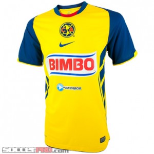 Anyway, just below the crest is the obligatory Nike swoosh in yellow. Beneath the swoosh is the “Bimbo” logo, which fits in very well with the shirt, and below that, is the Powerade logo, just for good measure. Normally, the team crest and production company are on either side of the chest, but I like what Nike did here. It kind of brings a unity to the shirt whereas the regular design style would have looked a little too chaotic. The other element tying it all together is the stylized abdomen. Starting from the armpit, there are wide diagonal bands, designed to simulate the abdomen muscles, I suppose. There’s also a vertical yellow band that begins about mid rib level and spans the stylized abdomen while gradually thinning out at the bottom. Oh, and there’s also a Corona logo printed across the shoulder blades on the back of the soccer jersey, because eh, what’s one more sponsor?
As for the feel of the shirt, I’d say the inside feels pretty much like a basketball jersey. It’s 100% polyester and made with Nike Dri-FIT technology, so it’s comfortable. The price tag is $63.99 at SoccerPro.com, which is definitely a fair price for this jersey. It’s a standard Nike jersey with some pretty cool design aspects, and it’s for a team in a lesser known professional league. What’s not to like?
Written by: Kris Dyer, soccerprose.com
AC Milan Home Jersey Review
I’ve previously reviewed the Adidas Bayern Munich home jersey with great delight (that’s right, delight), and the same goes for the Adidas AC Milan home jersey. In my humble opinion, Adidas nailed it this season with their jersey design. But first, let’s pause for a quick aside about AC Milan’s team—Oguchi Onyewu is on the roster. That’s a pretty prestigious squad to find an American on. I mean, sure he hasn’t necessarily played, which is more of a detriment to his international play, but eh, at least he can say he was on the squad, right?
Alright, now that I got that Onyewu business out of my system, let’s talk about AC Milan Jersey. In my Bayern review, the only drawback to the jersey was the gaudy sponsor logo—this is not the case with the Milan jersey. “Fly Emirates” is printed across the chest, but it doesn’t have a giant white rectangular background to it, so the text isn’t obnoxious in the least. It fits well in the jersey (“Fly” even fits neatly into one vertical stripe, oh my). As with every other professional jersey out there, the team crest is up on the left chest and the Adidas logo is on the right chest. Staying true to the AC Milan colors, the vertical stripes composing the shirt are alternating red and black. The sleeve pattern keeps in line with the other Adidas jerseys this season with the shoulder designed with the three Adidas stripes (red with a black background) which eventually give way to the stripe pattern prevalent on the rest of the jersey. Another sweet feature about this jersey is the side abdomen. This is basically what makes the stripe pattern work for the rest of the jersey. Two stitched gold borders stretch from both sides of the armpit and down to the hip, and they provide the border for a solid black area of the abdomen. It adds a touch of class and a touch of a fortitudinous image for any player rockin’ this jersey on the pitch. I’m glad the makers of the jersey chose to keep the gold elements limited, so the jersey doesn’t reach into the garish echelon. From my memory, which may or may not be faulty, AC Milan has always had this kind of jersey pattern with the vertical stripes, but it was missing something to make it stand out. I think Adidas changed that this year.  The golden curves on either side of the abdomen really stick out as a finishing touch on the jersey. As opposed to the Bayern Munich jersey, the back of the AC Milan jersey is blank and continues the stripe pattern. I think that works because the colors are red and black; any other colors, and I think it gets a little obnoxious. Overall, this is definitely a solid jersey in design and execution. It’s also made of 100% polyester with Adidas CLIMACOOL technology, which is pretty much standard for Adidas jerseys. The $69.99 price tag is also pretty standard for an Adidas jersey, so I’ll say what I usually say in this situation: It’s worth it, especially if you’re a fan of AC Milan or know a fan and need a holiday gift idea!
Written by: Kris Dyer, soccerprose.com
Long Sleeve Italy Jersey Review
I’m a person that prefers long sleeve jerseys to short sleeve. I could lie to you and tell you it’s for functional reasons, but it’s really about the style. I just like the way it looks—Doesn’t Fernando Torres seem like a football Fonzie when he’s sportin’ long sleeves on the pitch? That said, I was pretty happy to have the Puma long sleeve Italy home jersey on my desk ready for review.
The jersey is, of course, the same Italy blue as it’s always been. The collar has the same design that looks like it was once a real collar that had been popped and cut off about an inch from the shirt. I suppose there’s nothing necessarily wrong with that, though. It also has the green white and red lining the top for an added touch of Italian flair. What I really like about this long sleeve jersey is the shoulder and collarbone area. The shoulders have these sweet little white curves on the front that start from the collarbone, and they swoop down to their end around the elbow. What also adds to these curves is that they are stitched to appear underneath the blue of the shirt, as if they were ripping open the blue part. At the end of the curves, in the middle of both arms, Puma has stitched their recognizable logo in classy fashion. There has to be a word for it that I just don’t know, but the logo adds a little somethin’ somethin’ to the jersey.
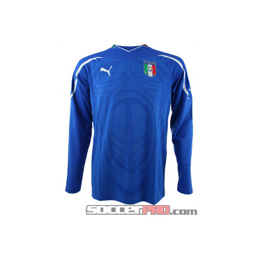 The back of the shirt also has the same idea, but the white curves follow the shoulder blades instead of the shoulder itself, you know, for continuity. The chest of the jersey of course has the Puma logo and the Italian crest, which I think we can all agree is pretty suave. The torso also has this subtle design that I think is meant to mimic the muscles of the most cut human being on earth (hint: Chuck Norris). My only beef with this design is that it sort of looks like the face of a Predator, pre duel with Schwarzenegger. Even so, I think the design combined with the shoulder/collarbone look produces a good looking jersey. Most of the time with the subtle torso designs, it pretty much looks like a series of curves and intersecting lines, so I don’t really think people will mind this one too much. It adds some style and modernity to the jersey, which I think is a pretty solid buy at $79.99. It’s a little on the thin side, so you’ll need something underneath if you want to wear it on a cold day, but, other than that, this jersey is a standard, quality Puma shirt that will definitely last and provide awesomeness for years to come.
Written by: Kris Dyer, soccerprose.com
Manchester City 2010-11 Kit Review
I’ve never really noticed Manchester City much until they spent a purported 6.3 bajillion dollars this past season on the likes of players such as Carlos Tevez. No big deal. It stands to reason, then, that the squad would require jerseys fitting for Champion hopefuls. Umbro delivered.
With this year’s Manchester City jersey, I really think Umbro nailed it. It’s classic and reserved in design, yet it still has that edge that looks like the jersey of a contender. The powder blue color of the home jersey is great, and I think that the polyester/spandex fabric is perfect for the color. It isn’t shiny or dull—in fact, it looks pretty natural. Oh, it’s super comfortable, too. It feels like the kind of shirt you’d wear to lounge around on a Sunday, so I can imagine how comfortable it is to play in. The collar/shoulder/sleeve design of this home jersey is also well done. The collar has a little style so that it looks like it dips inside the shirt when it comes around the front of the neck. It has a look that the shoulder, torso and collar fabric are all pieced together in a smooth puzzle. As for the shoulders and sleeve, I like the fact that Umbro kept it super simple with a little homage to jersey style from 20 or so years ago. The ends of the sleeves sport a stitched, thick white cuff to mix it up a little. The sleeves are also set apart from the torso as a kind of overlay, stitched on top of the torso. As for the torso, all I can say is what I’ve been saying. It’s sleek, classic and simple.
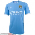 The Man City crest is stitched into the left chest and the Umbro logo is stitched into the right. I’m lovin’ the Etihad Airways logo on the front as well. It doesn’t stick out like a sore them and present itself as the reason for the soccer jersey; instead, the logo works with the jersey to send a message that is power, especially with that font. Yowza. Aside from the logos and crests, I like the simplicity in the vertical lines in the fabric. They’re unimposing, but still noticeable. The side of the abdomen carries on the same idea as the sleeves, sans white cuff.
Overall, there isn’t a thing I dislike about the jersey. Sure, there are things that I could have disliked had they been executed wrong, but Umbro did a superb job. Kudos to the company! A jersey will run you the standard $79.99, but, for a jersey of this quality and style, I think it’s worth every penny. I have to wonder how many United fans saw this City jersey and thought, “Man, that’s slick. Too bad I can’t pick one up!”
Written by: Kris Dyer, columnist, soccerprose.com
Bayern Munich Home Jersey Review
The other week, when I loaded up the SoccePro website, I noticed a certain banner with a certain photo of Arjen Robben wearing this year’s Bayern Munich home jersey. I immediately thought, “That’s a fine lookin’ jersey on a goofy lookin’ dude.” I mean, if it even looks good on the Dutch winger, then you know there’s something special about the jersey.
First, let me tell you what I don’t like about the jersey because there isn’t much. In fact, it’s not even that I don’t like it, but rather that it seems out of place. I’m talking about the T-Mobile logo sitting in the middle of the shirt. It’s not that I hate sponsors and their logos; I just think a smaller white banner would’ve sufficed. Alright, with that said, everything else about the jersey is pure win. The vertical stripe pattern with alternating red and white stripes (plus, every other stripe is mesh) just does it for me. Usually I find this kind of stripe pattern a little obnoxious, but man, Adidas really came through for Munich this season. The sleeves have the 3-stripe pattern in white on a solid red background that covers the shoulders while the main vertical stripe pattern of the jersey finishes off the rest of the sleeve. Munich’s crest is of course stitched into the left chest with a gold border, which adds a, dare I say, exquisite touch.
That’s right folks. I busted out a three dollar word. Anyway, another reason the stripes work for me is because they’re broken up by the side abdomen design of the jersey. It has a thin black outline on both front & back that starts from beneath the arm and curves around to the hip, and it basically fences in a completely red section. Combine this with the shoulder design, and you, my friend, have a sensational jersey. The back of the shirt has “Bayern München” stretched across the shoulder blades in big white letters, and, sitting just below the collar, are the letters F.C.B. It’s hard to say what kind of style those letters are stitched with—Matt and I came to the decision that it’s either Old English style, or Old German, if there is such a thing. Either way, it’s definitely intricate and definitely awesome. As you can tell, I love everything about this item. This jersey will run you about $69.99 a piece, which is pretty standard for this kind of quality Adidas clothing. It has all the standard construction and fabric of an Adidas replica jersey, which includes CLIMACOOL and all that jazz. You know the drill; it’s a quality made and designed shirt, and a surefire way to get in the good graces of a Bayern München fan.
Written by: Kristopher Dyer, columnist at soccerpro.com
Adidas Liverpool Track Top Review
The Adidas Liverpool Track Top is a classic full-zip jacket that combines the quality materials of Adidas with the storied history of Liverpool for a warm wear during practices and warm-ups.
Adidas has produced a 100% cotton scarlet track top that exemplifies a professional look and feel while you are warming up for your big game.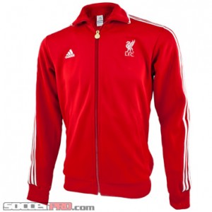 The coat may appear light, however the material keeps you quite warm in relatively cold conditions. So if you feel like you need anything more than a jersey to put underneath the track top, you probably will not. The coat has a couple features which will make you feel even warmer, too. When slipping on this jacket, you’ll notice the two pockets in the front of the track top so you can keep your hands warm if you don’t own field gloves, a nice feature. The arms also get smaller in width so the material feels tighter toward your hand. This helps keep the cold winter breezes away. Finally, the track top is full zip so a player can zip up all the way to the chin, a surprisingly popular feature of track tops today.
The coat itself is classic and relatively plain, something players may or may not appreciate depending on their respective flashy styles. The classic three white stripes line the arms and work well with scarlet red color used throughout the rest of the jacket. A small Adidas logo is stitched to the left side of the the zipper so it appears on the player’s chest. On the right side, the coat dons the Liverpool liver bird logo (part of the club’s crest since 1901, although not incorporated into gear until 1955, with the lettering “L.F.C.” directly underneath (for Liverpool Football Club). The work on this looks professional and clean. The zipper also looks great too, a feature a player normally couldn’t care less about. The Liverpool liver bird along with the LFC lettering underneath is imprinted onto the zipper, along with the club’s famous slogan: “You’ll Never Walk Alone”. Overall, a surprising and intricate bonus for the jacket.
The Liverpool Track Top may be plain but it has plenty of redeeming features, such as its surprising warm features and attention to details (such as the intricate zipper). Overall, it’s a solid purchase, especially now that Liverpool have finally decided to start playing some great football (win against Chelsea, hooray!)
Villarreal Home Jersey 2010-11 Review
Currently a contending for a La Liga title, El Submarino Amarillo are currently sporting a new Home jersey that is turning heads.
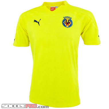 The Villarreal Home Jersey is made by Puma and the 100% polyester material is a testament to that. Putting on the jersey, I felt quite comfortable. The jersey has a similar feel to that of a mesh material. The back of the jersey supports this view, as intricate patterns line the material. At a closer look, the design looks similar to a spine, which is quite eye-catching too and a bold decision from Puma. However, the mesh feel makes the jersey quite breathable for torrid game time conditions, a definitive plus for the shirt. Some will knock the bright yellow colors, but the tradition of the club and the players who play for the Yellow Submarine will testify they are proud to wear the bright colors (players like Giuseppe Rossi, Marcos Senna, and our very own Jozy Altidore). Remember, Jozy Altidore notched his first goal for the storied club recently? He’ll start hitting his stride in this styling jersey and he’s leading the US attack to in his USA Home Jersey.
The team’s crest is nested in the upper right hand corner of the jersey, as is tradition with most soccer jerseys out there. A Puma logo is stitched into the upper left hand corner and looks nice and clean. One noticeable missing feature of the jersey is the lack of a sponsorship. This makes the feel a bit plain, however the layout of the two front pieces looks professional and subtle. I’m personally a fan of teams not selling shirt space to failing insurance companies or firms you’ve simply never have heard.
Many will be deterred by the bright yellow colors, but in all honesty, the trend in jerseys and soccer gear is to have others look at you in your noticeable threads. The Villarreal Home Jersey is certainly noticeable, flashy, yet simple and professional thanks to its lack of sponsorship. Puma built a jersey that will last thanks to the 100% polyester fabric. The jersey has some unique features, such as the mesh back design and the vibrant colorway. Overall, a solid jersey.
Written by Chris Behrens, writer for soccerprose.com
Barca Away Long Sleeve Jersey 2010-11 Review
Currently in third place in the La Liga table, FCB is looking to take out all opponents with such an all-star lineup. Also, Barcelona has come out with a new away jersey for the 2010-2011 season. 
As always, the FCB patch and blue and red stripe are present on the front of the jersey with the standard Dri-Fit technology. This is an authentic jersey designed to all the specifications of the actual players, and the La Liga patch on the right sleeve looks good and is double stitched so it won’t come loose in the washing machine. On the left sleeve is the club’s motto: Mes Que un Club which is Spanish for more than a club. To the Catalans, FCB isn’t just a football club; it’s a major part of the Catalan national culture. Catalans live and die for Barcelona football, and you can feel the sense of defiance and strength permeating from the jersey. Across the front the club is continuing to showing its support for UNICEF. Barca teamed up with the organization benefitting children in developing countries in 2006. The club has been donating at least 1.5million Euros each year for children that are affected by HIV/AIDS.
Barca has been known for the traditional blue and red stripes but in recent years they have had some wild away and third kit jerseys. Some previous colors include highlighter yellow, gold, orange, and a somewhat salmon looking color. And this cool mint green on the new away jersey actually seems to be a throwback from the early 90s which was the end of the stabilization years for the Club.
Some say it looks ugly and honestly it may be; but it should be appreciated that the club is looking back to a time when Barcelona became supreme in Spain and the rest of Europe. The jersey is high quality the colors are vibrant, and it’s built to last. The long sleeved design will help to keep you warm and the Dri-Fit fabric , while not water proof, will serve to break the wind on a blustery day. In all honesty, its popularity will probably depend more on how many goal Lionel Messi slots in wearing it than anything else.
Written by: Providence Tucker for soccerprose.com
Tottenham Review Picked up by ESPN
Hey all,
We just had a product review of the new 2010-11 Tottenham Kit picked up by ESPN.com.
Check it out here: Tottenham 2010-11 home and away kit  – Puma
All the best,
Staff of soccerprose.com
