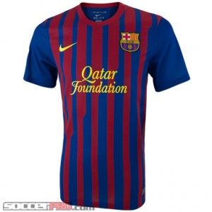
After we sold out of the Barcelona Home Jersey several weeks ago, we’ve been patiently waiting for the return of that familiar navy/maroon shirt in the shop. We weren’t disappointed. I may be an oddity in that I like to be 100% surprised by new soccer jerseys—I don’t seek out images before the jersey is released, and I try to stay as much in the dark as I can. That way, I’m completely surprised by the look and feel of a jersey. In any case, this Barcelona jersey is largely the same general idea as last seasons but with a couple of tweaks.
 The most obvious changes to the shirt are the new sponsor (and consequently logo) as well as the narrower navy/maroon stripes. To address the elephant in the room, yes, the new sponsor is the Qatar Foundation. Let’s set the ethical and political implications aside for another conversation because that’s not really our goal today. Based on looks alone, the sponsor logo fits the shirt well and doesn’t announce itself obnoxiously. It’s the same golden yellow as the previous sponsor, UNICEF, but it’s in an italicized serif font rather than the bolded sans-serif of last season. Setting the backdrop for the sponsor logo, the Nike swoosh and Barcelona team crest are the classic navy/maroon stripes. However, the new stripes are narrower and have a stylized diagonal design that causes the stripes to have a sloping ledge to them, going from the right hip up to the left shoulder (or vice versa if you prefer). It’s a small touch that I didn’t notice at first glance, but I love it. It’s refreshing to see such a subtle touch complement the traditional straight vertical stripes. You’ll also notice that the sleeves do not share the stripe pattern and are instead a solid navy. I honestly could see this jersey being just as fine with stripes, but the solid navy sleeves are a welcomed change that should look sharp on the pitch. The final change you’ll notice is in the collar—rather than a shallow v-neck, Nike has decided to go with a crew neck. This basically comes down to your personal preference, and I honestly find both styles appealing. In any case, Nike made a good decision to stay with the same basic design formula and to only make a couple minor adjustments.
The construction and fit of this shirt is the same as any other Nike jersey that utilized DRI-fit technology. It’s a thinner shirt with mesh sides, so moisture and heat aren’t going to be an issue with the jersey. It’s also made of 100% polyester, which means you don’t have to account for too much shrinkage. Tack this onto the fact that it’s pretty true to size, depending on how you like your shirts. It isn’t constricting, but it isn’t loose, either. I wear a size medium shirt, and a medium jersey fits me really well. The sleeves come about an inch or two above my elbow while the waist came down to the bottom of my hip bone. This bad boy retails at $79.99, which is the standard price for a Nike jersey. It may seem steep, but it’s completely worth the quality of both construction and design; protip: when you wash it, don’t dry it in the machine. Instead, let it dry on a clothes rack to increase the life of the jersey.
Written by: Kris Dyer, soccerprose.com


